


The aim of this project was to work with the charting library D3.js as it is designed to handle lots of data very efficiently and very quickly. Marry that up with React and it's ability to manage state, component and props and you have a really powerful combination of tools.
I use Axios to bring in the data from the weather API https://open-meteo.com/, and I use Framer Motion to animate the charts and other UI elements.


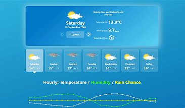
Here is the mobile design for the Weather website I have created and some of its key features:

- Todays weather summary, including the location, temperature, wind speed and direction
- A select box to allow you to change locations around the world
- 7 days of weather are displayed with a button for each day, upon clicking gives a summary of that days weather
- Interactive hourly line charts showing the temperature, humidity and rain chance for that day and a summary beneath it
- You can hover over the line chart for pointing devices, or touch the chart to see the hourly data
- A couple of donut charts for quick visual reference, showing the humidity and rain chance
- The sunrise and sunset times
Let's dive in...
Starting with App, I have 4 key pieces of state used throughout the website:
src\App.js
const [selectedDay, setSelectedDay] = useState(todaysDate)
const [weatherData, setWeatherData] = useState()
const [weatherDayData, setWeatherDayData] = useState()
const [weatherWeekData, setWeatherWeekData] = useState()
const [currentLocation, setCurrentLocation] = useState(locations[0])
These values are passed down in to the 4 primary components:
return (
  <>
    {weatherData && (
      <CurrentDayInfo
        key={`CurrentDayInfo${selectedDay}`}
        data={weatherData.data}
        locations={locations}
        currentLocation={currentLocation}
        setCurrentLocation={setCurrentLocation}
      />
    )}
    {weatherWeekData && (
      <DayPicker
        key={`DayPicker${selectedDay}`}
        weekData={weatherWeekData.data}
        setWeatherData={setWeatherData}
        setSelectedDay={setSelectedDay}
        currentLocation={currentLocation}
      />
    )}
    {weatherDayData && (
      <LineChart
        key={`LineChart${selectedDay}`}
        data={weatherDayData.data}
      />
    )}
    {weatherDayData && (
      <SelectedDayInfo
        key={`SelectedDayInfo${selectedDay}`}
        dayData={weatherDayData.data}
      />
    )}
  </>
);
<CurrentDayInfo />displays today's weather information and a select box to allow you to change thecurrentLocationpeice of state. When this happens, the weather API is called to get the weather data for the new location.<DayPicker />shows 7 buttons for one week of forecasted weather. When the user picks a day, the weather API is called to get the chosen day's data.<LineChart />is where all the D3 chart work begins. This doesn't modify any of the state, it just receives data.<SelectedDayInfo />displays a couple of pie charts and the sunrise and sunset values. This doesn't modify any of the state, it just receives data.
I have a useEffect, which listens to currentLocation and selectedDay for changes before calling functions which query the weather API:
useEffect(() => {
	getWeatherData(new Date(), setWeatherData, setWeatherWeekData, currentLocation)
	getWeatherDayData(selectedDay, setWeatherDayData, currentLocation)
}, [currentLocation, selectedDay])
These functions are pretty straight forward Axios calls, setting the aforementioned state once they receive data:
export const getWeatherDayData = (date, setWeatherDayData, currentLocation) => {
axios.get(`https://api.open-meteo.com/v1/forecast?latitude=${currentLocation.latitude}&longitude=${currentLocation.longitude}&hourly=temperature_2m,relativehumidity_2m,precipitation_probability,rain&daily=weathercode,temperature_2m_max,temperature_2m_min,sunrise,sunset,uv_index_max,precipitation_probability_max¤t_weather=true&forecast_days=1&start_date=${date}&end_date=${date}&timezone=auto`)
.then(function (response) {
setWeatherDayData(response)
})
.catch(function (error) {
console.log(error);
})
}The API URL is a template literal with the currentLocation latitude, longitude values and the date passed to it.
Let's skip to some D3 code
D3 gives you a lot of control over how its charts are presented via DOM manipulation/creation and CSS. It has many built-in functions to handle pie, line and bar charts to name a few. It will handle creating things like the X and Y axis, calculating minimum and maximum values whilst scaling this to fit the dimensions of your chart.
I'll skip over <CurrentDayInfo /> and <DayPicker /> to the <LineChart /> component, so we can get straight to talking about the focus of this article, D3. I'll talk about some of their highlights later. Suffice to say both of those components trigger updates to the weather data that this component will handle.
src\components\LineChart.js
import { useState, useRef, useEffect } from 'react'
import * as d3 from "d3";
import { LinePath } from './LinePath';
import { arrayOfWeatherAndTimeObjs } from '../utilities/formatWeatherData';

const ChartInner = ({ data }) => {
  const { hourly } = data
  const { temperature_2m, relativehumidity_2m, precipitation_probability, time } = hourly

  const [isTablet, setIsTablet] = useState(true)

  const svgOpt = {
    width: 1040,
    innerWidth: undefined,
    height: 270,
    margin: {
      top: 50,
      right: 20,
      bottom: 120,
      left: 30,
    },
    strokecolor: ["white", "#33eb33", "yellow", "#b4e6ff"],
    fillcolor: ["white", "#33eb33", "yellow", "#b4e6ff"],
    chartCircleSize: isTablet ? "6" : "4",
    chartCircleSizeActive: isTablet ? "20" : "9",
  }

  svgOpt.innerWidth = svgOpt.width - svgOpt.margin.left - svgOpt.margin.right

  ...
A few effects are imported from React, D3 is imported, LinePath is a component that draws the line graph and arrayOfWeatherAndTimeObjs is a function to format the weather data in the way LinePath needs it.
The component begins receiving data as the only prop. This is the weather API data for the selectedDay. A few values are destructured from this, namely: hourly, then temperature_2m, relativehumidity_2m, precipitation_probability and time.
I have isTablet state, which acts like a device check to allow me to apply settings if the user is using a mobile or not.
Then I have an object with various SVG configuration settings. These help me draw the chart and calculate various offsets, circle sizes and colours.
// Chart Refs:

const temperatureRef = useRef(null);
const humidityRef = useRef(null);
const pChanceRef = useRef(null);
const hoverRectanglesRef = useRef(null);
const lineChartSVGRef = useRef(null);

// Weather Charts Line Data:

const hourlyTempData = arrayOfWeatherAndTimeObjs(temperature_2m, time, 'temperature')
const hourlyHumidityData = arrayOfWeatherAndTimeObjs(relativehumidity_2m, time, 'humidity')
const hourlyPChanceData = arrayOfWeatherAndTimeObjs(precipitation_probability, time, 'pChance')

const chartXScale = d3
  .scaleLinear()
  .domain([hourlyTempData[0].date, hourlyTempData.at(-1).date])
  .range([svgOpt.margin.left, svgOpt.width - svgOpt.margin.right])

// Define Charts to show:

const lineCharts = [
  { id: "temperature", data: temperature_2m, chartXScale, ref: temperatureRef },
  { id: "humidity", data: relativehumidity_2m, chartXScale, ref: humidityRef },
  { id: "pChance", data: precipitation_probability, chartXScale, ref: pChanceRef },
]
I continue on to set up some refs that I use later to set up some hover and touch events which I'll go into detail later.
I then set up some variables to store each of the weather types: hourlyTempData, hourlyHumidityData and hourlyPChanceData. This is done by passing the destructured weather data to my arrayOfWeatherAndTimeObjs function returning an array of objects like this:
[
  {date: Sun Apr 30 2023 00:00:00 GMT+0100 (British Summer Time), temperature: 0},
  {date: Sun Apr 30 2023 01:00:00 GMT+0100 (British Summer Time), temperature: 0},
  {date: Sun Apr 30 2023 02:00:00 GMT+0100 (British Summer Time), temperature: 0},
  (...for every hour in the day)
]
Now I have this data setup, it's ready to pass to D3 so it can create the line charts X axis scale. The charts X axis has an entry for each hour of the day:
const chartXScale = d3
  .scaleLinear()
  .domain([hourlyTempData[0].date, hourlyTempData.at(-1).date])
  .range([svgOpt.margin.left, svgOpt.width - svgOpt.margin.right]);
scaleLinear is a D3 function that takes a domain and range.
domain takes two values, establishing the minimum and maximum values of the data. In this case, it's hours of the day, so 0 (or midnight) would be the first value and the maximum value would be 23. I use a handy array.at(-1) function to get the last item in the array.
range takes two values, establishing the size of the space to map the values from the domain. So in this case it's the width of the SVG and I've used the svgOpt margin values to trim the chart a little.
When a value is passed to chartXScale, D3 can calculate where that value would be plotted on the chart. All I will be passing to it will be an hour in the day.
The charts are nearly ready to go, I just need to create an array for them so I can .map over this later to display the 3 charts:
const lineCharts = [
  { id: "temperature", data: temperature_2m, chartXScale, ref: temperatureRef },
  { id: "humidity", data: relativehumidity_2m, chartXScale, ref: humidityRef },
  { id: "pChance", data: precipitation_probability, chartXScale, ref: pChanceRef },
]
Here is the return values for the <LineChart /> component.
return (
  <LineChartWrapper>
    <svg
      ref={lineChartSVGRef}
      viewBox={`0 0 ${svgOpt.width} ${svgOpt.height}`}
    >
      {lineCharts.map((chart, index) => (
        <LinePath
          key={chart.id}
          svgOpt={svgOpt}
          time={time}
          data={chart.data}
          count={index}
          refValue={chart.ref}
          chartXScale={chart.chartXScale}
        />
      ))}
      <g>
        {hourlyTempData.map((time, index) => {
          return (
            <text
              key={`${index}hourTxt`}
              x={chartXScale(time.date)}
              y={svgOpt.height - 20}
              fill={svgOpt.fillcolor[0]}
              textAnchor="middle"
            >
              {hourlyTempData[index].date.getHours()}
            </text>
          )
        })}
      </g>
    </svg>
  </LineChartWrapper>
)
Drawing the path for the line
I have created a <LinePath /> component to isolate drawing a line chart, so I can easily recycle and reuse this component, passing it the data it needs whenever I want a new line path for the chart. Hooray React!
src\components\LinePath.js
import * as d3 from "d3";
import { motion } from "framer-motion";
import { arrayOfWeatherAndTimeObjs } from "../utilities/formatWeatherData";

export const LinePath = ({
  svgOpt,
  time,
  data,
  count,
  refValue,
  chartXScale,
}) => {
  const weatherData = arrayOfWeatherAndTimeObjs(data, time, "weatherValue");

  const chartYScale = d3
    .scaleLinear()
    .domain(d3.extent(weatherData.map((item) => item.weatherValue)))
    .range([svgOpt.height - svgOpt.margin.bottom, svgOpt.margin.top]);

  const line = d3
    .line()
    .x((item) => chartXScale(item.date))
    .y((item) => chartYScale(item.weatherValue));

  const lineData = line(weatherData);

  return (
    <g>
      <motion.path
        initial={{ pathLength: 0 }}
        animate={{ pathLength: 1 }}
        transition={{ duration: 1 }}
        d={lineData}
        fill="none"
        stroke={svgOpt.strokecolor[count]}
        strokeWidth="2"
      />
      <g ref={refValue}>
        {weatherData.map((time, index) => (
          <motion.circle
            key={index + time}
            initial={{ opacity: 0 }}
            animate={{ opacity: 1 }}
            transition={{ duration: 0.15, delay: 0.05 * index }}
            r={svgOpt.chartCircleSize}
            cx={chartXScale(time.date)}
            cy={chartYScale(time.weatherValue)}
            fill={svgOpt.fillcolor[count]}
          />
        ))}
      </g>
    </g>
  );
};
Quite a few props are passed in if you remember from the <LineChart /> component.
I use data and time in the arrayOfWeatherAndTimeObjs function we saw earlier to format an array of objects which I store in weatherData.
I then establish a chartYScale using the scaleLinear function, domain and range in the same way we established the chartXScale. One of the differences this time is for the domain, I use D3s extent function which returns two values and figures out the min and max values from my weatherData, thanks again D3 for doing all this calculating for me.
Then I create a line variable that takes a D3 line function to prepare it for receiving data to plot a line. The line function takes x and y values, looping over the data it receives and passing it to the chartXScale or chartYScale respectively.
Then I create the lineData, passing the weatherData to the line function to generate the path data, which looks like:
M30,150L73.043,150L116.087,150L159.13,150L202.174,150L245.217,150L288.261,150L331.304,150L374.348,150L417.391,150L460.435,150L503.478,150L546.522,150L589.565,150L632.609,150L675.652,150L718.696,150L761.739,116.667L804.783,83.333L847.826,50L890.87,83.333L933.913,116.667L976.957,150L1020,150This is basically svg language for drawing a path. Now we have this, we can pass it to the <path> element, via the d attribute that we declare in the return.
Right now, there's just a line drawn for our data. But, I want to add a small circle at each plotted point to improve the readability of the chart for the user.
This is the final part of this component, and I map over the weatherData again, returning an svg <circle> element. This is placed using the cx and cy attributes with the values from the chartXScale or chartYScale functions respectively.
Framer Motion
If you're wondering what the motion.path and motion.circle are, that's Framer Motion and how you attach it to elements and define animation. The initial attribute sets how the element's animation begins, in this case with an opacity of 0. The animate attribute sets how the element animation finishes, becoming visible with an opacity of 1. And the transition attribute sets the animation behaviour, allowing you to configure things like duration and delay.
Enhancing the chart: displaying the hour by hour information
I realised on mobile, the chart alone didn't describe the hourly values and since it was much smaller than desktop, you couldn't really see the chart very well. That's why for mobile I added the temperature, humidity, rain chance values beneath the chart.
For desktop, I re-used the same component, refashioned into a tooltip that follows your mouse around when you hover over the chart.
On mobile I'm quite pleased I managed to get the chart to update the details as you dragged over it with your finger instead of only having to tap each hour.
I didn't talk about this code earlier as I wanted to keep the example code as clearly focussed on how I used D3 to draw the charts and not cloud the explanation with all sorts of other features I added later to improve the overall experience.
Following is the code I added in each component to achieve this:
src\components\LineChart.js
const [toolTipVisible, setToolTipVisible] = useState(isTablet ? true : false)
const [toolTipHour, setToolTipHour] = useState()
const [toolTipTemp, setToolTipTemp] = useState()
const [toolTipHumidity, setToolTipHumidity] = useState()
const [toolTipRainChance, setToolTipRainChance] = useState()
const [toolTipX, setToolTipX] = useState()
const [toolTipY, setToolTipY] = useState()

let hoverRectangleLocations = [0]
const [touchedRectanglePrevious, setTouchedRectanglePrevious] = useState(0)
toolTipVisible is used to track if the tooltip is visible or not. This is for desktop and not mobile since the tooltip component is always visible on mobile.
toolTipHour, toolTipTemp and toolTipHumidity, toolTipRainChance store the hovered, or touched values on the chart.
toolTipX and toolTipY store the mouse position on desktop so that the tooltip display follows the users mouse around the chart.
hoverRectangleLocations is an array which later populates with the x position of a bunch of svg rectangles used to detect either hover or touch.
touchedRectanglePrevious stores state for when the selected hour on the chart has changed and I need to reset the plotted circle back to its original size.
Let's look at the changes made to the <svg> element which displays the chart:
<svg
  ref={lineChartSVGRef}
  viewBox={`0 0 ${svgOpt.width} ${svgOpt.height}`}
  onMouseOut={() => !isTablet && setToolTipVisible(false)}
  onMouseMove={(e) => moveToolTip(e)}
  onTouchMove={(e) => touchOver(e)}
>
The onMouseOut listener is setting some state which will hide the tooltip if the user is on desktop.
The onMouseMove listener will send the mouse event to a moveToolTip function.
And the onTouchMove listener will pretty much do the same as the onMouseMove, except it will send the touch event to the touchOver function.
Here is the moveTooltip function:
const moveToolTip = (e) => {
  const svgLeftPos = lineChartSVGRef.current.getBoundingClientRect().left;
  const mouseToSvgOffset = e.clientX - svgLeftPos;
  if (mouseToSvgOffset < 320) setToolTipX(e.clientX + 70);
  else setToolTipX(e.clientX - 280);
  setToolTipY(e.clientY - 50);
}
I save the horizontal starting position of where the chart begins to the svgLeftPos. This is then used to calculate the offset from where the mouse is using the e.clientX.
I do a quick check to make sure the mouse isn't too close to the left hand side and if it is, I want to shift the tooltip over to the right hand side of the mouse so it doesn't disappear off screen. Otherwise, the tooltip sits on the left side of the mouse by default.
Here is the touchOver function:
const touchOver = (e) => {
  resetChartCircles(touchedRectanglePrevious)
  const touchX = e.touches[0].clientX - svgOpt.margin.left
  const touchedRectangle = hoverRectangleLocations.findIndex(
    (item) => item > touchX
  )
  if (touchedRectangle >= 0) {
    setTouchedRectanglePrevious(touchedRectangle)
    setHourOnChart(touchedRectangle)
  }
}
Here the user is on mobile and tapping, or swiping across the chart.
First, I call the resetChartCircles function which I'll explain later, but it will reset the previously selected circle back to its default size.
Then much like the moveTooltip function I calculate where the user touched the screen on the x axis (horizontally). This would return a value like 385 for example, which is the number of pixels from the left hand side.
This value is then checked against the hoverRectangleLocations array to find the index of where that value is greater than each of the values in the array. This tells me which hour they have either tapped on, or swiped over.
I then set some state to store that value as the previously selected hour and then call the setHourOnChart function which looks like this:
const setHourOnChart = (hour) => {
  setTouchedRectanglePrevious(hour)
  resetChartCircles(touchedRectanglePrevious)
  setToolTipVisible(true)
  setToolTipHour(hour)
  setToolTipTemp(hourlyTempData[hour].temperature)
  setToolTipHumidity(hourlyHumidityData[hour].humidity)
  setToolTipRainChance(hourlyPChanceData[hour].pChance)
  lineCharts.forEach((chart) => {
    const target = chart.ref.current
    target.children[hour].setAttribute("r", svgOpt.chartCircleSizeActive)
  })
}
This function updates all of the state values mentioned earlier which will update the display for the user with all the weather values.
To indicate to the user which hour they are either hovered over, tapped or swiped over, I finish this function with a loop over all the line charts, changing the selected circle to a larger size so the user knows that's the hour they've selected.
To do this I had to update the <svg> element, where before I mapped over the hourlyTempData to output the <text> element and show the hour. I have now added a <rect> element (svg rectangle element) to detect the mouse events.
Here is that modified code:
<g ref={hoverRectanglesRef}>
  {hourlyTempData.map((time, index) => {
    return (
      <g key={`${index}hoverRectangle`}>
        {/* Rectangle to catch hover event for tooltip */}
        <rect
          width={hoverRectangleWidth}
          height="100%"
          x={chartXScale(time.date) - hoverRectangleWidth / 2}
          y="0"
          fill="#ffffff00"
          onMouseOver={() => mouseOverHour(index)}
          onMouseOut={() => mouseOutHour(index)}
        />
        {/* Hour number on X axis */}
        <text
          x={chartXScale(time.date)}
          y={svgOpt.height - 20}
          fill={svgOpt.fillcolor[0]}
          textAnchor="middle"
        >
          {hourlyTempData[index].date.getHours()}
        </text>
      </g>
    );
  })}
</g>;
This allows me to attach the onMouseOver and onMouseOut events on the <rect> element, passing them over to the mouseOverHour and mouseOutHour functions respectively:
const mouseOverHour = (hour) => setHourOnChart(hour);
const mouseOutHour = (hour) => !isTablet && resetChartCircles(hour);
Highlights from the other components
Selecting location:
The <CurrentDayInfo /> component has a html select field listing the locations around the world the user can select to view weather.
I have a locations object that looks like:
locations = [
  { value: "London", latitude: "51.50", longitude: "0.12"},
  { value: "Paris", latitude: "48.85", longitude: "2.35"},
  { value: "Rome", latitude: "41.90", longitude: "12.49"},
  ...
]
Which the component maps over, returning the select field options:
<LocationSelect value={currentLocation.value} onChange={handleSelect}>
  {locations.map((location) => (
    <option key={location.value} value={location.value}>
      {location.value}
    </option>
  ))}
</LocationSelect>;
The currentLocation is a React useState value passed in from App.js. It is here where this value is set when the user picks a different location.
I felt having to click/tap the select, then click/tap the location felt a bit laborious and instead added previous and next buttons that would simply move the select field forwards and backwards through its options.
Displaying an image and description for the weather type
The weather API gave me a weatherCode in the returned data which was simply a numerical value.
So I created a mapping for these numbers to return an object containing an image and text description:
import png_sunny from "../images/sunny.png"
import png_sunnyToCloudy from "../images/sunny to cloudy.png"
import png_fog from "../images/fog.png"
import png_showers from "../images/showers.png"
...(other images)

const text_clearSky = "Clear sky"
const text_mainlyClear = "Mainly clear, partly cloudy, and overcast"
const text_fog = "Fog and depositing rime fog"
const text_drizzle = "Drizzle: Light, moderate, and dense intensity"
...(other texts)

const img_clearSky = <img src={png_sunny} alt={text_clearSky} />
const img_mainlyClear = <img src={png_sunnyToCloudy} alt={text_mainlyClear} />
const img_fog = <img src={png_fog} alt={text_fog} />
const img_drizzle = <img src={png_showers} alt={text_drizzle} />
...(other image elements)

export const weatherCodes = {
  0: { image: img_clearSky, text: text_clearSky },
  1: { image: img_mainlyClear, text: text_mainlyClear },
  2: { image: img_mainlyClear, text: text_mainlyClear },
  3: { image: img_mainlyClear, text: text_mainlyClear },
  45: { image: img_fog, text: text_fog },
  48: { image: img_fog, text: text_fog },
  51: { image: img_drizzle, text: text_drizzle },
  ...(other mappings)
}
There were more mappings and quite a lot of duplicate values for weather codes, so doing it this way saved on the repetition.